Showing posts with label arhelon. Show all posts
Friday, July 20, 2012
Wednesday, July 18, 2012
See what I mean?
These are the Arhelon needlepoint yarn colors (minus the yellow, which ran out, and the black, which is on a cone). They're all fingering weight wool, hand dyed (by me, for a former project- this is all leftover yarn).
In person, and in the ball, there are 5 distinct colors- red, brown, white, green and blue (with two shades of blue).
Look what happens when I remove the color- how many shades do we have now? Amazing, isn't it? The red and brown are also very similar, tonally, and if I had been doing a Fair Isle project with just those two colors, the end result would have been a vaguely mottled bit of mud. It wasn't such a big deal for the red and brown on Arhelon because they never touch each other, so their real life coloration is distinct.
Further proof- here's Arhelon, pre-sharpie. If I was to guess how many colors I'd used, based on this photo, I would have said black, white, and 2 shades of something...
When in reality, I used black, white, yellow, brown, red, green, and two shades of blue. What amazes me is that the most distinct color difference is between the two blues, rather than either blue with the green.
Next time, I'll scan the yarns before I start a project (unless subtle is the point, which it may be for the Mucha design).
In person, and in the ball, there are 5 distinct colors- red, brown, white, green and blue (with two shades of blue).
Look what happens when I remove the color- how many shades do we have now? Amazing, isn't it? The red and brown are also very similar, tonally, and if I had been doing a Fair Isle project with just those two colors, the end result would have been a vaguely mottled bit of mud. It wasn't such a big deal for the red and brown on Arhelon because they never touch each other, so their real life coloration is distinct.
Further proof- here's Arhelon, pre-sharpie. If I was to guess how many colors I'd used, based on this photo, I would have said black, white, and 2 shades of something...
When in reality, I used black, white, yellow, brown, red, green, and two shades of blue. What amazes me is that the most distinct color difference is between the two blues, rather than either blue with the green.
Next time, I'll scan the yarns before I start a project (unless subtle is the point, which it may be for the Mucha design).
Monday, July 16, 2012
Someday, I'll learn
There's this Knitting Teacher who always tells her Fair Isle workshop students to test out the yarn for any given project by scanning the skeins (or taking a picture) and then digitally turning the shot into black and white. She says that if you can't tell how many colors there are in the black and white shot, then they're too close tonally to be distinguishable in your finished piece.
This Knitting Teacher (who teaches all over the country, I might add) makes a point to say this in every workshop. She even has examples to show the students, proof that, yep, if the colors aren't markedly different in b/w, they won't be in real life either, and a whole lot of effort will be expended on not a lot of effect.
I wish I could remember that teacher's name. And even more so, I wish I would follow her damn advice.
Case in point...
I give you Arhelon, with the central motif done. 19000 sts (yeah, I did the calculation).
If you stand real close, you can see that the turtle has green feet, head and tail, and the fishies have green scales... as opposed to the blue shades of the water. But from any distance at all, they look close enough as to be identical. If I'd done the Scan Test before starting, I would have known this. As it was, I knew it well before finishing the piece, but I kept telling myself that the color difference would show up more, the more I got done.
I was wrong.
So I looked at Arhelon, and I contemplated it. And then I remembered this Knitting Teacher who sometimes shocks her students by whipping out a Sharpie to correct small errors in Fair Isle knitting. Sometimes the students are amused, sometimes they gasp in astonishment (and dismay), but always, they're surprised that it actually works.
I looked at Arhelon, and I looked at my Sharpies, and then I looked at both again some more, and then...
Yep, I like this a lot better. I dotted each green stitch (feeling far more guilty doing it on needlepoint than I ever do on knitting) with a light green Sharpie, and man, am I happy I did. Now we can see that the fishies and turtle are not also made of seawater.
And the colors are still mottled.
But next time, next time dammit, I'm going to do what that teacher said BEFORE I start the project.
This Knitting Teacher (who teaches all over the country, I might add) makes a point to say this in every workshop. She even has examples to show the students, proof that, yep, if the colors aren't markedly different in b/w, they won't be in real life either, and a whole lot of effort will be expended on not a lot of effect.
I wish I could remember that teacher's name. And even more so, I wish I would follow her damn advice.
Case in point...
I give you Arhelon, with the central motif done. 19000 sts (yeah, I did the calculation).
If you stand real close, you can see that the turtle has green feet, head and tail, and the fishies have green scales... as opposed to the blue shades of the water. But from any distance at all, they look close enough as to be identical. If I'd done the Scan Test before starting, I would have known this. As it was, I knew it well before finishing the piece, but I kept telling myself that the color difference would show up more, the more I got done.
I was wrong.
So I looked at Arhelon, and I contemplated it. And then I remembered this Knitting Teacher who sometimes shocks her students by whipping out a Sharpie to correct small errors in Fair Isle knitting. Sometimes the students are amused, sometimes they gasp in astonishment (and dismay), but always, they're surprised that it actually works.
I looked at Arhelon, and I looked at my Sharpies, and then I looked at both again some more, and then...
Yep, I like this a lot better. I dotted each green stitch (feeling far more guilty doing it on needlepoint than I ever do on knitting) with a light green Sharpie, and man, am I happy I did. Now we can see that the fishies and turtle are not also made of seawater.
And the colors are still mottled.
But next time, next time dammit, I'm going to do what that teacher said BEFORE I start the project.
Friday, July 13, 2012
Wednesday, July 11, 2012
Further experimentation
Remember the Mucha transfer and the 14ct needlepoint mesh? I haven't started work on it yet because I'm not done with Arhelon, but I knew when I made the transfer that the image would be better served by using a smaller mesh, like, oh, say, an 18 count. Well, the 18ct canvas that I bought on eBay arrived today, and in the nature of further experimentation, I decided to make an identical transfer and iron it to the 18 ct just to see how it looked (the canvas isn't wasted if I don't use it, I can either use it with a charted design, or I can iron another image on the back side).
The first thing I found out is that printable t-shirt transfer sheets for dark fabric aren't the same as t-shirt transfer sheets for light fabric. For some reason, the image didn't transfer to the canvas at all. I mean, not even a spec. I have no idea what I did wrong, but I'm sure it was something. So mysterious.
I have more light transfer sheets coming, but I'm too impatient to wait, so I used the leftover piece from the first transfer, and ironed that on the 18 ct mesh. There was enough *ink* left to make a transfer. The design was very faint, of course, but still visible.
Here are both of the canvasses side by side- the 14ct (on the right) is prettier of course, because it has far more ink. But even at a distance, I can see that I'll get much more detail in the finished piece if I work the 18 ct (with embroidery floss most likely).
And even though the colors aren't perfectly transferred to the canvas, I can refer to the printout for help. I will probably do both faces though, just as a comparison, though I doubt I'll needlepoint both full images- there are far too many other designs I'd like to tackle.
The first thing I found out is that printable t-shirt transfer sheets for dark fabric aren't the same as t-shirt transfer sheets for light fabric. For some reason, the image didn't transfer to the canvas at all. I mean, not even a spec. I have no idea what I did wrong, but I'm sure it was something. So mysterious.
I have more light transfer sheets coming, but I'm too impatient to wait, so I used the leftover piece from the first transfer, and ironed that on the 18 ct mesh. There was enough *ink* left to make a transfer. The design was very faint, of course, but still visible.
I positioned the plain paper printout of the image under the new printed mesh...
and used a sharpie to trace the most important outlines.
Here are both of the canvasses side by side- the 14ct (on the right) is prettier of course, because it has far more ink. But even at a distance, I can see that I'll get much more detail in the finished piece if I work the 18 ct (with embroidery floss most likely).
And even though the colors aren't perfectly transferred to the canvas, I can refer to the printout for help. I will probably do both faces though, just as a comparison, though I doubt I'll needlepoint both full images- there are far too many other designs I'd like to tackle.
But I'm not starting either one until I finish Arhelon. I'm over half done now. Woohoo!!!
Monday, July 9, 2012
Sometimes a notion...
So I was looking at my Arhelon needlepoint project. I realized that I'm almost half done with it (not counting the solid border), and I'm not tired of needlepointing yet (nor have I learned how to do the basketweave stitch). I've been looking around on eBay and Etsy for my next project, but have not found one that spoke to me the way this one did.
So, I reverted to form- I made my own. Not by charting, which would be no different from charting a cross stitch design, or a Fair Isle sweater... I just didn't want to follow a chart- I've learned that I like having the lines drawn for me, and the color choices at least suggested (if not set in stone).
And I didn't draw on the canvas either, even though I bought a large set of colored Sharpies at Sam's Club in Sioux Falls a couple of weeks ago, just for that purpose.
Instead, I found an image online that I like a lot.
This one- it's a Mucha print. Mucha's beautiful beautiful beautiful Art Nouveau art has recently been added to the public domain, so it's all copyright free now. I love this image, and I love the colors.
Then I enlarged it, and removed the solid border (I can work that without having it on the canvas, and there was no point in wasting ink). I used PicMonkey to *sharpen* the image and *posterize* it, thereby reducing the colors. And then I printed it out just to see how it looked. It looked just fine.
And then I flipped the image in Paint and printed the flipped image on a printable iron-on transfer sheet.
And then following the manufacturer instructions, and after lining the transfer up carefully along the canvas grid, I pressed it. I was absolutely thrilled when I peeled the transfer backing off (and I'm pretty sure there's still enough *ink* on the transfer sheet to make an interesting t-shirt... if I ever feel like using it).
See how beautifully it transferred? I chose this image in part because the face was in profile. I am certain that my current needlepoint skills would not do a full-on face justice. And in truth, this mesh is still too big for this design- if the craft store had had 18ct mesh on hand, I would have bought that. But it didn't, so I'll have to simplify the design as I stitch. And it's very likely that I'll have to do some surface embroidery for the Zodiac signs. But we'll see how that goes as I work on it.
The transfer *stuck* only to the mesh- there are very few holes that will have to be poked (which won't be an issue anyway), and this is a washable transfer, so the colors won't run when the finished piece is blocked.
I am totally thrilled with how it came out, and will absolutely make more canvasses this way (I have more transfer sheets and some 18ct mesh ordered and on the way). But The New Me does not start many projects, leaving most of them unfinished. I will touch neither needle nor thread to the Mucha until I finish Arhelon, which luckily is coming along pretty darn quickly...
So, I reverted to form- I made my own. Not by charting, which would be no different from charting a cross stitch design, or a Fair Isle sweater... I just didn't want to follow a chart- I've learned that I like having the lines drawn for me, and the color choices at least suggested (if not set in stone).
And I didn't draw on the canvas either, even though I bought a large set of colored Sharpies at Sam's Club in Sioux Falls a couple of weeks ago, just for that purpose.
Instead, I found an image online that I like a lot.
This one- it's a Mucha print. Mucha's beautiful beautiful beautiful Art Nouveau art has recently been added to the public domain, so it's all copyright free now. I love this image, and I love the colors.
Then I enlarged it, and removed the solid border (I can work that without having it on the canvas, and there was no point in wasting ink). I used PicMonkey to *sharpen* the image and *posterize* it, thereby reducing the colors. And then I printed it out just to see how it looked. It looked just fine.
And then I flipped the image in Paint and printed the flipped image on a printable iron-on transfer sheet.
And then I cut a 16" x 16" piece of 14ct blank needlepoint (which I just happened to buy in Aberdeen a couple of days ago) and pressed it flat. I trimmed all excess paper from the printed transfer sheet and let it dry for 30 minutes (that was a loooong 30 minutes).
And then following the manufacturer instructions, and after lining the transfer up carefully along the canvas grid, I pressed it. I was absolutely thrilled when I peeled the transfer backing off (and I'm pretty sure there's still enough *ink* on the transfer sheet to make an interesting t-shirt... if I ever feel like using it).
See how beautifully it transferred? I chose this image in part because the face was in profile. I am certain that my current needlepoint skills would not do a full-on face justice. And in truth, this mesh is still too big for this design- if the craft store had had 18ct mesh on hand, I would have bought that. But it didn't, so I'll have to simplify the design as I stitch. And it's very likely that I'll have to do some surface embroidery for the Zodiac signs. But we'll see how that goes as I work on it.
The transfer *stuck* only to the mesh- there are very few holes that will have to be poked (which won't be an issue anyway), and this is a washable transfer, so the colors won't run when the finished piece is blocked.
I am totally thrilled with how it came out, and will absolutely make more canvasses this way (I have more transfer sheets and some 18ct mesh ordered and on the way). But The New Me does not start many projects, leaving most of them unfinished. I will touch neither needle nor thread to the Mucha until I finish Arhelon, which luckily is coming along pretty darn quickly...
Wednesday, June 27, 2012
True to my word...
TA DA!!!!!
This may be the cutest thing I've ever done, and I can only take credit for adding the border and the quilting, since everything else was printed on the fabric by Spoonflower. But man, this is cute.
Every one of the squares is adorable.
Yellow was the perfect color for the border, though dark blue would have worked too. I just didn't want dark blue.
Robots with ice cream cones... hee...
The coordinating fabric has teeny little matching robots.
That's a whole lotta stitches.
It always amazes me how different a quilt looks after washing. This is intended as a baby gift eventually, and it has to be totally machine washable and dryable.
So much more texture and interest now.
And once I finished the quilt, I could work on the needlepoint without guilt. There isn't going to be a whole lot of tonal difference between the blues of the water and the greens on the turtle, so I think maybe I need a splash of another color in there... maybe some muted reds. What do you think?
This may be the cutest thing I've ever done, and I can only take credit for adding the border and the quilting, since everything else was printed on the fabric by Spoonflower. But man, this is cute.
Every one of the squares is adorable.
Yellow was the perfect color for the border, though dark blue would have worked too. I just didn't want dark blue.
Robots with ice cream cones... hee...
The coordinating fabric has teeny little matching robots.
That's a whole lotta stitches.
It always amazes me how different a quilt looks after washing. This is intended as a baby gift eventually, and it has to be totally machine washable and dryable.
So much more texture and interest now.
And once I finished the quilt, I could work on the needlepoint without guilt. There isn't going to be a whole lot of tonal difference between the blues of the water and the greens on the turtle, so I think maybe I need a splash of another color in there... maybe some muted reds. What do you think?
Tuesday, June 26, 2012
Cheating... sorta...
Okay, it's not really cheating- I couldn't work on the Robot Quilt in the car yesterday or the day before, so I did some work knitting.
This is the class sample for one of my SAFF 2012 workshops. It's an exclusive pattern, and will not be taught again until late 2013. I am thrilled with how it's coming out, though I remembered pretty quickly why I usually don't knit Fair Isle in the car.
When we got home yesterday afternoon, I couldn't bring myself to drag the sewing machine downstairs so that I could sew the binding to the Robot Quilt and get it finished.
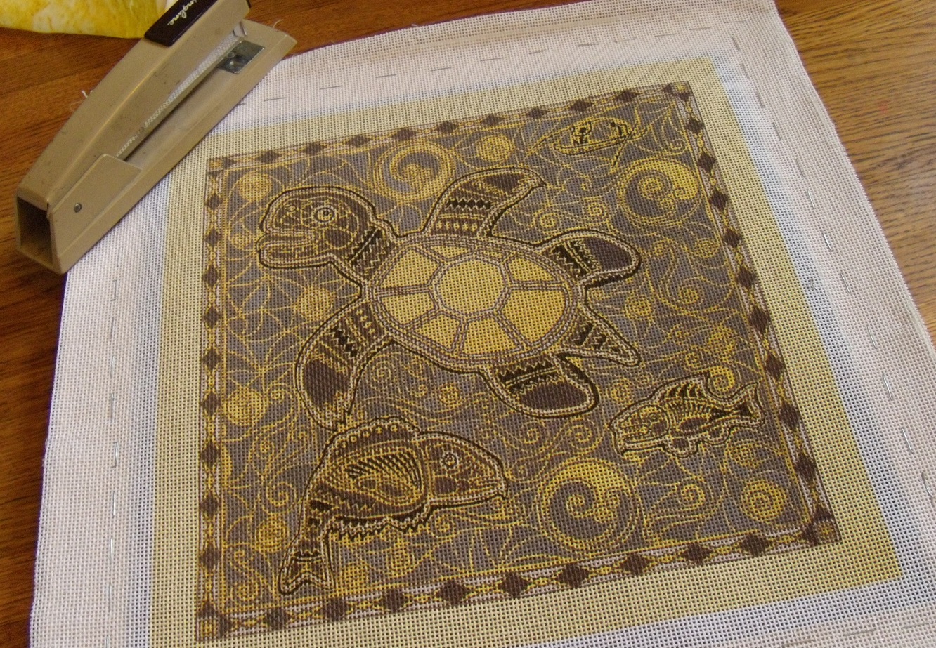
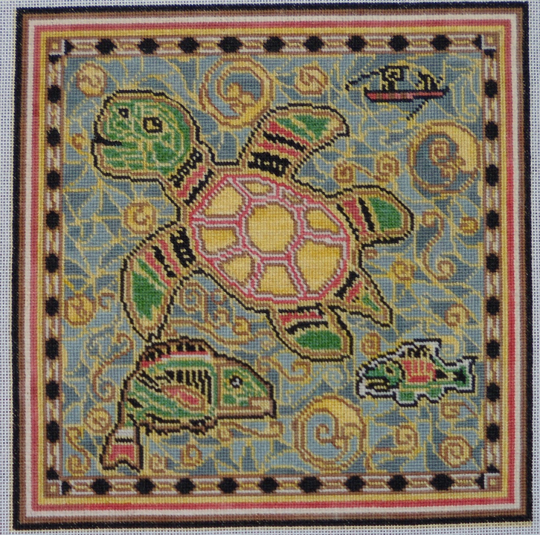
So, really, I had no choice but to work a little bit on the needlepoint canvas that I bought on eBay. The name is Arhelon, and my friend Kathy tells me that it looks like an Australian Aboriginal design. I was drawn to it because it's cool (natch), but also because all those little areas will make for very little boredom in stitching. I assume that big blank areas of solid color needlepoint are like big blank areas of stockinette stitch, which is the most boring knitting possible. When I excitedly showed my needlepointing friends the design, they said, "Oh my, you certainly chose a challenging design", which is the story of my life.
At first, I tried to use the scrolling frame that I also bought on eBay, but it quickly became obvious that the frame wasn't going to work. It's flimsy, it wiggles, and worst of all, it doesn't hold the fabric taut. So when we were in Sioux Falls, I went to Michael's and bought some art stretcher frames- cheap and easy, and they work perfectly. The above frame? Going in the garbage- I am not going to inflict anyone else with it.
Though stapling the canvas to the frame wasn't quite as easy as it ought to have been...
I did manage to get it done. The canvas printed portion is 12" x 12", and the stretcher frames are 16" long (that's from outside corner to outside corner, the inside opening is about 13", which is big enough).
I am still on a strict stash-busting campaign, so I'm using leftover yarns for this needlepoint. This yarn won't be as sturdy as commercial tapestry wool, but though I don't know what this will grow up to be, I do know that it's not going to be a chair cushion or footstool cover, so it's not going to get a lot of wear and tear. I hand dyed all of these yarns, except for the yellow (which is also hand dyed, just not by me), and the black, which is a wool camel blend. They'll all be mottled, which will give the piece some lovely random shading.
This is a 14ct mesh, which means that there are more printed lines than there are squares for the design (I had the option of ordering the design printed on an 18ct mesh, but I wanted to finish this piece during my lifetime), so I'm having to simplify and condense a little of the design, but I think it's going to come out beautifully. I know that it's against Needlepoint Rules, but I'm saving the outside border until last, because I'm not sure what yarn to use, and want to make absolutely sure that I'll have enough. Also, I may do some kind of textured stitch.
Here's a nice closeup of the colors. It has been easily 20 years since I've done any needlepoint at all (and most of that was on plastic canvas). My stitching is okay for a beginner, but I'm not going to take a pic of the back side- at least not yet. I am certain that it won't pass muster with real needlepointers (most of the sections are too small for basketweave stitch, and my hands slip into half-cross stitch mode without thinking, which I understand is a no-no).
This is going to be an adventure, fer shure. And before I do any more work on it, I WILL finish the Robot Quilt.
This is the class sample for one of my SAFF 2012 workshops. It's an exclusive pattern, and will not be taught again until late 2013. I am thrilled with how it's coming out, though I remembered pretty quickly why I usually don't knit Fair Isle in the car.
When we got home yesterday afternoon, I couldn't bring myself to drag the sewing machine downstairs so that I could sew the binding to the Robot Quilt and get it finished.
So, really, I had no choice but to work a little bit on the needlepoint canvas that I bought on eBay. The name is Arhelon, and my friend Kathy tells me that it looks like an Australian Aboriginal design. I was drawn to it because it's cool (natch), but also because all those little areas will make for very little boredom in stitching. I assume that big blank areas of solid color needlepoint are like big blank areas of stockinette stitch, which is the most boring knitting possible. When I excitedly showed my needlepointing friends the design, they said, "Oh my, you certainly chose a challenging design", which is the story of my life.
At first, I tried to use the scrolling frame that I also bought on eBay, but it quickly became obvious that the frame wasn't going to work. It's flimsy, it wiggles, and worst of all, it doesn't hold the fabric taut. So when we were in Sioux Falls, I went to Michael's and bought some art stretcher frames- cheap and easy, and they work perfectly. The above frame? Going in the garbage- I am not going to inflict anyone else with it.
Though stapling the canvas to the frame wasn't quite as easy as it ought to have been...
I did manage to get it done. The canvas printed portion is 12" x 12", and the stretcher frames are 16" long (that's from outside corner to outside corner, the inside opening is about 13", which is big enough).
I am still on a strict stash-busting campaign, so I'm using leftover yarns for this needlepoint. This yarn won't be as sturdy as commercial tapestry wool, but though I don't know what this will grow up to be, I do know that it's not going to be a chair cushion or footstool cover, so it's not going to get a lot of wear and tear. I hand dyed all of these yarns, except for the yellow (which is also hand dyed, just not by me), and the black, which is a wool camel blend. They'll all be mottled, which will give the piece some lovely random shading.
This is a 14ct mesh, which means that there are more printed lines than there are squares for the design (I had the option of ordering the design printed on an 18ct mesh, but I wanted to finish this piece during my lifetime), so I'm having to simplify and condense a little of the design, but I think it's going to come out beautifully. I know that it's against Needlepoint Rules, but I'm saving the outside border until last, because I'm not sure what yarn to use, and want to make absolutely sure that I'll have enough. Also, I may do some kind of textured stitch.
Here's a nice closeup of the colors. It has been easily 20 years since I've done any needlepoint at all (and most of that was on plastic canvas). My stitching is okay for a beginner, but I'm not going to take a pic of the back side- at least not yet. I am certain that it won't pass muster with real needlepointers (most of the sections are too small for basketweave stitch, and my hands slip into half-cross stitch mode without thinking, which I understand is a no-no).
This is going to be an adventure, fer shure. And before I do any more work on it, I WILL finish the Robot Quilt.
Saturday, June 23, 2012
Subscribe to:
Posts (Atom)